Cox, E 2014
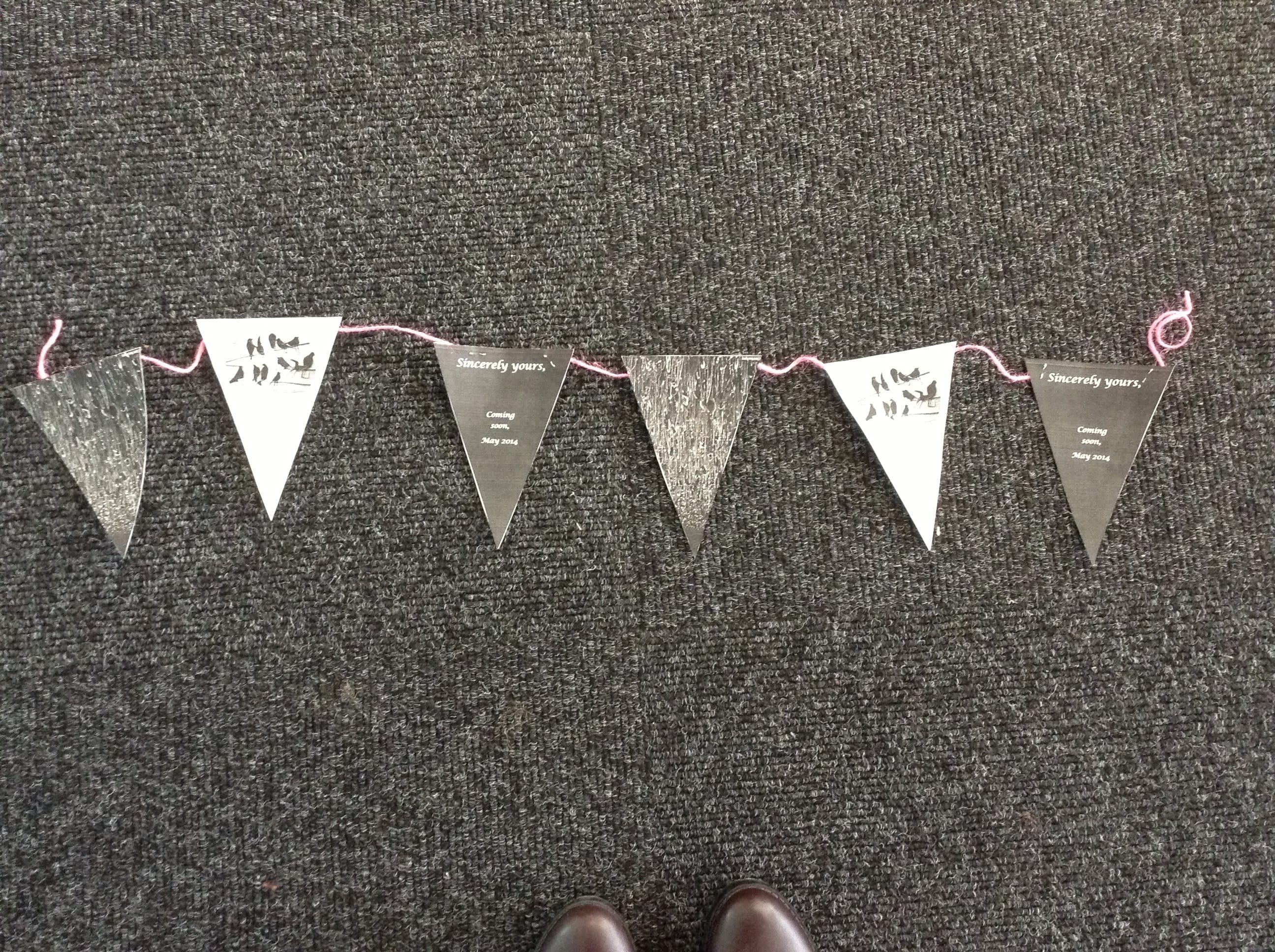
Unfortunately I had a complete nightmare with the colour printer the day I wanted a colour mock up! However, here is a teaser of the marketing bunting that will be available soon. They will eventually be red, white and blue after taking inspiration from The Museum of Lincolnshire Life, where they had bunting hanging in the vehicle room. I previously mentioned this in my blog, The Grand Day Out. The red section will be poppies, the white our logo and the blue the title, date, time and where it will be performed. We will be putting this up in the Lincoln Performing Arts Centre, the Lincolnshire Archives and also in The Museum of Lincolnshire Life. We will be using this as our pre-marketing material bringing out the leaflets and flyers closer to the actual date.
I really enjoyed designing our own version of a ‘poster’ as it is something completely different to what you would usually see for a performance promotion. It is bold, decorative and eye-catching because of the three vivid colours. I love how the ideas and inspiration from our research process are creeping into our current development. I really want to use bunting in our performance in order to tie in our ‘visual identity’ (Pieters 2008, p.1) as a theatre company.
Works Cited
Cox, E 2014
Pieters, R. Wedel, M (2008) Visual Marketing: From Attention to Action. Routledge: USA.