We had been dancing around in the beginning with many topics and themes for our company name and ended up with… “Drum roll please!”
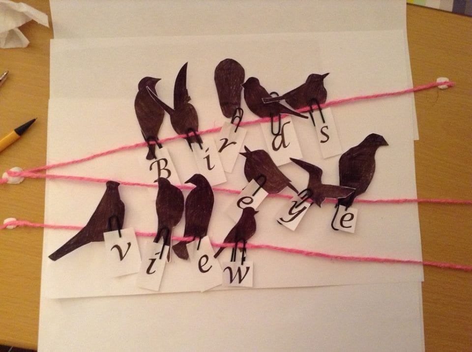
‘Birds Eye View Theatre’.
I played around with the computer hoping to develop a digital image however, I wanted the logo to reflect our company manifesto. So I had an arts and crafts day trying out some different ways of creating birds. I did not want to make the logo war themed as the theme for this performance could be a one-off, if we were to take our company on after this module. I ended up photographing the finished result – once I had secured it to my desk with plenty of tape. I then added a black and white filter to the photo.
Cox, E 2014
Having made the logo, it keeps the aims of our manifesto applicable as it a real, handmade logo, an honest take on birds (especially as I am not the best at creating bird silhouettes, as you can see). The only thing I changed digitally was the filter, but I don’t think we would have wanted the original colour of the string, especially as it is pink!
Cox, E 2014
It was important for me to get the right image for our logo as it would be our consistent ‘visual identity’ (Pieters 2008, p.1) and this is what people will relate us too throughout this process. I love how the birds look as though they are on a washing line or a telephone wire looking down, and literally have a “Birds Eye View”.
Images cited
Cox, E (2014)
Pieters, R and Wedel, M (2008) Visual Marketing: From Attention to Action. Routledge: USA.